One system.
22 brands.
Building Loblaw's first enterprise design system from scratch — architecting a multi-brand, multi-product foundation that served Canada's largest retailer across grocery, pharmacy, apparel, and financial products.
No system. No consistency. No shared language.
Loblaw Companies Limited is Canada's largest food retailer — 22 brands including Shoppers Drug Mart, Joe Fresh, PC Financial, No Frills, and Real Canadian Superstore. Each brand had its own product team, its own codebase, its own design approach. There was no shared design system, no common component library, and no cross-team design language.
I was brought in as the sole designer on the Shared Components team to discover the problem space and architect a solution — working with 3 engineers to build something that had never existed at Loblaw before.
The organization didn't agree on what a design system even was
Before designing anything, I interviewed product designers, developers, and PMs across teams to understand their pain points, workflows, and mental models. What I found wasn't just a tooling problem — it was an organizational alignment problem.
"We already have some symbols in a Sketch file. Isn't that a design system?"
"We don't really need design. All we need is some reusable code snippets to share across the company, regardless of brand."
"I've never really collaborated with a designer before. The PM assigns me a Jira ticket and I design with code — which, I guess, is terrible, but fast."
"LDS should only have white-label components — consolidate all brand sites into one set of white-label components."
One system for everything — or systems that actually work?
Upper management wanted a single white-label system serving all 22 brands. My discovery showed this was architecturally problematic — a grocery delivery experience, a loyalty program, a cosmetics store, and an apparel site have fundamentally different UX problems, business rules, and tech stacks.
My pitch: a two-layer architecture. A white-label foundation with shared scaffolding components, paired with product-level pattern libraries per brand — giving teams a shared base without forcing convergence where divergence was legitimate.
Component Cut-Up Workshop
To test the feasibility of a shared white-label approach, I ran a component cut-up workshop with 20+ participants — product teams and directors from both Shoppers Drug Mart Beauty and Joe Fresh. The goal: identify genuine overlaps, surface where convergence was impossible, and build organizational alignment through evidence rather than argument.
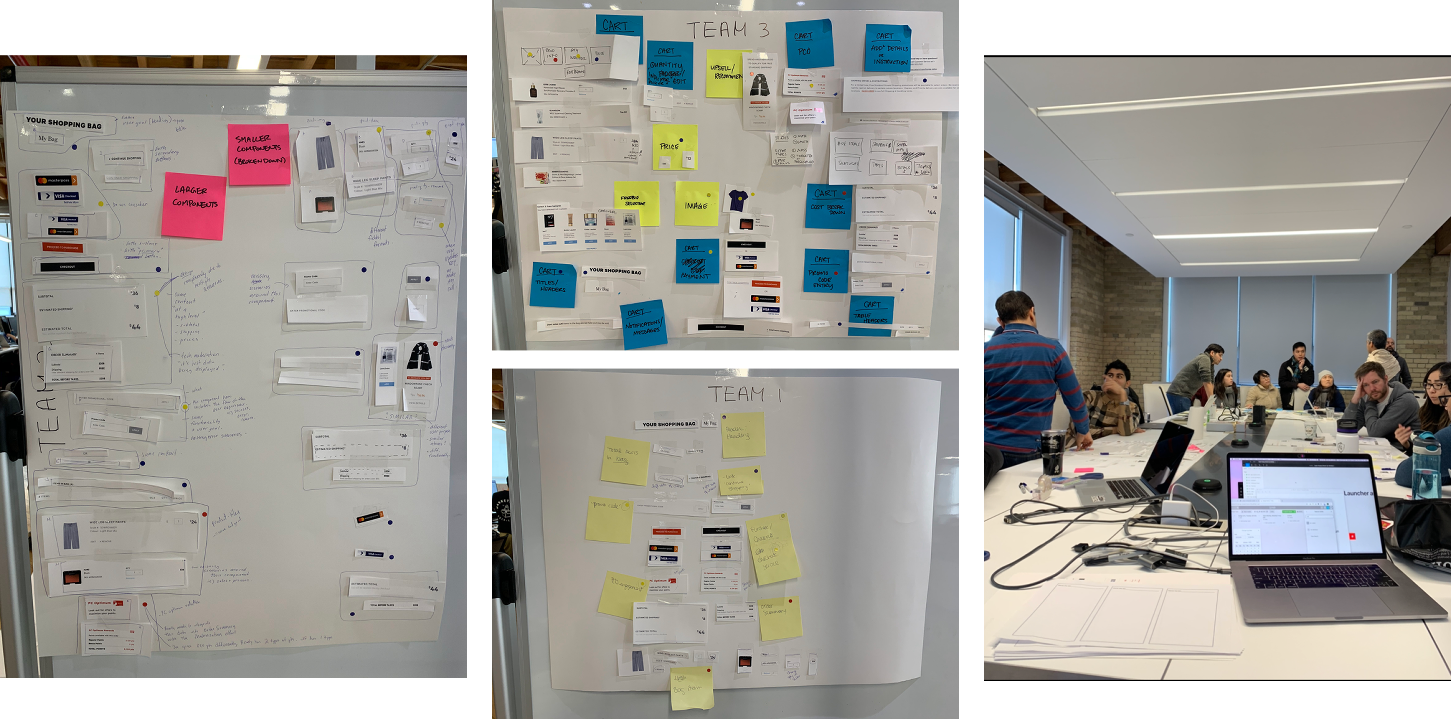
Even two seemingly similar eComm sites — beauty products vs. apparel — had conflicting business rules, different payment gateways, and different tech stacks.
Proceeded with two component types: white-label scaffolding for genuine shared structure, and product-specific components for brand-unique UX needs.
Workshop shifted the conversation from "should we do this?" to "here's what's actually shared and what isn't" — making the architecture decision undeniable through evidence.
From 0 to a system — and an org that understood why
What I learned
A design system isn't just components — it's the service design work underneath: the governance model, the contribution process, the mechanisms that let a community evolve the system together. Most people don't talk about this part, but it's what determines whether a system survives contact with an organization.
The hardest part wasn't the architecture. It was shifting an org that had never collaborated across design and engineering into one that understood why shared systems created leverage. That required running workshops, building trust incrementally, and making the value of the system undeniable through early wins — not through mandates.